Wednesday, June 5, 2013

New Documentary Film by Kitchen Sink Studios: "The Tallest Mural in Arizona"


Kitchen Sink Studios presents "The Tallest Mural in Arizona," a documentary film on the creation of a new mural in central Phoenix by Berlin-based JBAK. 

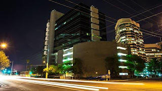
Love. Art. Family. Rebirth. All of them converge in one place in central Phoenix as James Bullough and Addison Karl, the American-born and Berlin-based graffiti artist duo known as JBAK, create a stunning piece of public art as part of the revitalization of a high-rise office building into a creative hub. Chris Nieto, who commissioned an Addison Karl mural on his downtown Phoenix building a year prior, was enlisted by JBAK to find a building owner willing to commission another work. Nieto connected with building owners and developers Tim O’Neil and Bob Karber, whom recently purchased an office high-rise on a very busy intersection in Downtown Phoenix. O’Neil and Karber saw this as a rare opportunity to commission a very special piece of public art and jumped on the opportunity to commission the artists to paint a mural.

Here's how Nieto summarized the story of how the film came together:


The story begins one year ago in the spring of 2012. American Born, Berlin-based artist Addison Karl, member of the internationally renowned muralist duo called JBAK, returned to Phoenix to visit family, and above all, work. Prior to his arrival Addison contacted anyone he could to identify a willing building owner and customer to allow him to paint his Phoenix mural. As per usual, Karl didn’t want just any wall, he wanted to do something bold, something big, he wanted to paint a landmark mural in his hometown Phoenix. 

Through word of mouth Karl was paired with local building owner Chris Nieto, who, fully aware of Karl’s talent, excitedly gave him a wall on his downtown Phoenix hotspot and commissioned the work. 

Nieto and Karl became fast friends; the mural, entirely out of spray-paint, was completed after a week of Karl frantically working to cover his 25 foot by 50 foot canvas. The end result, the Francesca D. mural was added to the fabric of the city’s core, on a heavily trafficked building less than 150 feet from the Phoenix Art Museum. 

Prior to leaving the states to return to his home in Berlin, Karl painted two other murals, one in Los Angeles and the other in Chicago. 

Over the course of a year Nieto and Karl wrote each other and planned for another project in Phoenix as part of a JBAK tour. JBAK: James Bullough and Addison Karl had never worked in Phoenix together which was very exciting to them all. 

In preparation for JBAK’s planned arrival to Phoenix, Nieto contacted anyone he could to identify a high-profile building and location whose owner would finance the work. As time drew near, and with no commitments from the various building owners Nieto identified, James Bullough, reluctantly decided to remain in Berlin and miss the tour as no financing was in place to pay for his travels. 

Two days prior to the scheduled leave date, Nieto connected with building owners and Tim O’Neil and Bob Karber, whom recently purchased an office high-rise on a very busy intersection in Downtown Phoenix. O’Neil and Karber, who saw this as a rare opportunity to commission a very special piece of public art, agreed to pay for James to fly to Phoenix, and commissioned JBAK to paint a wall on their building, giving them a 60 foot tall canvas on one of the busiest intersections in central Phoenix. 


Realizing the gravity of this potentially significant event with JBAK coming to visit and the now commission in place, Nick Hower and Kory Kapfer, owners of Kitchen Sink Studios, agreed to document the project and contribute his company’s resources to film a documentary. Kitchen Sink team member and award-winning film-maker Brandon Barnard worked tirelessly with his crew, matching JBAK’s every move to capture the project. 

Nieto and Karl’s grandmother, both Phoenicians, were selected by JBAK and the building owners as subjects for the mural to capture two different generations of people from Phoenix. 


JBAK (James Bullough & Addison Karl) —The artists 

Tim O’Neil & Bob Karber — Building owners and commissioners of the work 

Addison’s Grandmother — Inspiration for and subject in the mural 

Chris Nieto — Friend to the artists and subject in the mural 

KITCHEN SINK STUDIOS — Producers of the film, artists and patrons of the arts 

Brandon Barnard — Film-maker and patron of the arts

The film debut at a showing on June 5 at FilmBar in downtown Phoenix. It can be viewed on the Kitchen Sink Studios Vimeo page at this link. We hope you enjoy it!

Monday, February 25, 2013

Featured Project: Everything but the Kitchen Sink for Two High-Rise Campus Living Projects

One of the strongest sectors in the real estate market right now is campus housing, and no one is doing it better than Chicago-based Campus Acquisitions. And over the past few months, they entrusted Kitchen Sink Studios to create a full leasing and marketing package for their properties in Tucson and College Station, Texas that included...just about everything but the kitchen sink.

We started each project with architectural plans for the 15-story buildings. And that's it. Kitchen Sink was charged with helping to name the properties, creation of brand identity, development of computer animations, production of illustrative marketing videos, design of print collateral and development of mobile-friendly web sites for each of the two under-construction projects. 

First came the names, and we took into consideration the fact that the University of Arizona and Texas A&M environments are VERY different. For Tucson, the name had to reflect sort of an urban-aspirational feel to attract the kind of students who would want to live in the finest student housing in the area. And for College Station, we had to weigh a similar demographic while taking into consideration the "Texas" feel of College Station and the property's location in the town's Northgate district. 

For Tucson, the name "Level" was selected, and for College Station, the project was named "Rise at Northgate." The brand identities soon followed. 


While the branding process was taking place, the studio's 3D team set about bringing the properties to life through stunning renderings that would convey the scope and quality of each property. 


We then worked to develop collateral and leasing materials for the properties that featured the new brand identity as well as the animations, mixed in with lifestyle photography that helped create a vision that students and their parents could relate to. 


And, we translated all the work done on branding, identity and imagery into mobile-friendly web sites (here are links to Level and to Rise at Northgate) that include interactive floor plans and videos that show students what each project will be like once completed. 


We'll be working with Campus Acquisitions on several other projects across the United States with a similar scope of work. Our team always enjoys the opportunity to start from scratch on a project and create something that brings a vision to life, and these projects were no exception. 

Tuesday, February 19, 2013

Featured Project: New web site/photography for Federal Pizza


At Kitchen Sink Studios, we love working with clients who are pushing the envelope and setting the standard in their industries. Over the past few months, we've had the privilege of working with Upward Projects, the parent company behind several exceptional restaurants in the Valley — Postino, Winsdor, Churn and most recently Federal Pizza.

The Kitchen Sink team is working with Upward Projects on several fronts, but the first one to go public is the new web presence for Federal Pizza, their recently opened new concept in north central Phoenix. Federal Pizza is housed in a stunningly restored former bank building, and has already taken its place as one of the Valley's most exciting — and delicious — new restaurants.

A restaurant this great deserves a web presence that's just as strong. So based on the brand identity work done by local agency Switch, the Kitchen Sink team the Kitchen Sink team developed a new site featuring beautifully styled photography and extensive use of web fonts to preserve the look and feel of the Federal Pizza brand. The site also features fully responsive coding that creates a striking — but very user-friendly — interface for mobile devices.

"During the design process we decided that the photography and typography should be a focal point of the site," said Dan Freeman, Kitchen Sink's Director of Web Development. "Using a percentage-based architecture and responsive images we were able to keep the same look no matter what device you are using. The site looks amazing on a computer as well as tablets, large Android phones and scales down beautifully on smaller screens like the iPhone 4S. All of this is accomplished without loading extra images to keep the site snappy despite slow connections. Even the menu and navigation respond dynamically to the device size to give the user a great experience however they choose to view the site."

Our team spent a full day (and night) carefully lighting and art directing a shoot shortly after Federal Pizza opened to capture the ambiance and dining experience. The Upward Projects team has a unique and exceptional sense of style when it comes to how they present their restaurants and brands, and our challenge was to capture it in a way that would bring Federal Pizza to life on screens big and small.


One of our favorite features of the web site is the menu. While most restaurants simply upload a PDF file of their hard-copy menu, the Federal Pizza team wanted something more. So we coded the menu in HTML5 and with responsive coding to present their delicious fare in a memorable way. The menu is also coded with a content management system that allows the Federal Pizza team to make day-to-day changes and automatically have the formatting preserved.

We look forward to rolling out even more killer work for the Upward Projects team in the coming months — it's been a great client relationship so far, and we're looking forward to seeing where it goes in the future!

Wednesday, January 30, 2013

"Coconino," A Film By Kitchen Sink Studios

"Coconino" is a short film by Kitchen Sink Studios. This film represents one man's exploration into his beloved craft. He travels from location to location in search of more than just fish — he is searching for an experience.

We wanted to create a project where we could flex our muscles when it comes to creating exceptional film projects, while documenting the passion that many of us in the studio share for the outdoors. "Coconino" features some of the killer new equipment and editing techniques we've brought in-house in the past few months, combined with some of the most beautiful settings in our home state of Arizona. It's our own little love letter to both our work and to nature.

The project was filmed with our RED Camera and a a Go Pro camera by Kitchen Sink's Brandon Barnard, Director of Video Production, along with Justin Zellars and Tim Stansell. Creative Director Doug Bell was the "star" of the film.

"I enjoyed the hunt," Barnard said. "When four guys come together with like minded expectations and goals, they forget about 'how hard the hikes are' or 'how tired they have become after shooting for 16 hours' and begin to come together as a team or collective.

"I learned that no matter how much effort, time, money and motivation is involved, it is damn tough to catch a fish."

A highlight — Justin's contribution was some of the best shots in the video, through the use of the Go Pro and a track. But it didn't always go smoothly. At least now we know that Doug Bell's face — as well as the Go Pro — can withstand some impact with each other.

It wasn't all fun and games. The Kitchen Sink team wanted to create something that truly showcases our ability on film, skill that can translate into such areas as documentary filmmaking, ecotourism, travel films and just generally creating captivating products for small and large screen.

We hope you enjoy it!


Thursday, January 24, 2013

Featured Project: Responsive-coded web site and new print collateral for BestIT

It's always fun to work with clients who have a good sense of humor. And in the case of BestIT, they decided to use their sense of humor to create a unique message for their potential customers.

BestIT provides a variety of information technology solutions designed to reduce their clients' dependence on an internal IT department and help find the exact fit for their technology needs. But IT can be a pretty dry, jargon-filled field, and BestIT wanted to move away from that kind of messaging.

So, they hired Phoenix-based Randy Murray Productions to help them create short, humorous video vignettes to illustrate their competitive advantages and how they can help their clients. And they brought in the Kitchen Sink Studios team to build a web site around the videos and help them craft similarly clever messaging for the web and print collateral.

The videos feature "Seth," the average IT guy at the average company, as he bumbles thoughtlessly through his day while his company is tied in knots by IT problems. And it illustrates for potential clients that there's a solution that's better than "Seth" — and BestIT will help them find it.

The result is up and running at www.BestIT.com, and is fully coded to respond and display on mobile devices as well. 


It's a unique site because it is so heavily reliant on the videos, and it was an exciting challenge to make sure it translated well to mobile devices. 

The print collateral materials are coming off the presses soon, but they carry over the "Seth" theme quite nicely. Our team enjoyed the challenge of taking something that's usually dry and serious and turning it into an entertaining way of telling the BestIT story. 

Tuesday, January 22, 2013

Wanted: Web Developer

Kitchen Sink Studios, Inc. is looking for a web developer to help us develop a variety of new sites. The ideal candidate would work with the team to complete front and back-end web development using standards-based, semantic HTML and CSS. Our projects range from static sites to complete WordPress customization and everything in between. Ideally, the candidate would be located in the Phoenix area in order to collaborate on projects on a day to day basis within our studio.

Requirements:

Solid knowledge of HTML, CSS, standards
Experience with Wordpress backend customization
Ability to craft beautiful HTML and CSS by hand
Bonus if you have JavaScript/jQuery or PHP experience
Familiarity with coding for mobile devices and responsive coding desired
Maintain well-documented, reusable, and transferable code
3+ years of professional web development experience

Please send your resume via e-mail to us at resume@kitchensinkstudios.com. No phone calls por favor. Thank you for your interest!

Wednesday, January 9, 2013

Meet The New Team Member: Dan Freeman, Director of Web Design

The Kitchen Sink Studios team is growing, and the studio continues to add new talent that will enhance our creative product development and help our clients meet their lofty marketing and communications goals. Over the next few weeks, we'll be introducing you to several new team members who have joined the studio in the past couple of months.

First, meet Dan Freeman, Director of Web Development. Besides being a dead ringer for renowned singer and rapper Pitbull, Dan provides an extraordinary amount of expertise in coding web sites in HTML5, including mobile-responsive coding and the development of mobile-specific web sites.

Dan has already been heavily involved in several of the studio's most significant completed projects of the past few months, including the stunning new web and mobile presence for WORKSBUREAU, a new web site for BestIT that features dominant use of video, and the soon-to-be-launched site for the delicious new Upward Projects restaurant Federal Pizza.

Dan's exceptional skill set will ensure that Kitchen Sink Studios' clients continue to enjoy that most groundbreaking and state-of-the-art web site coding and development. Look for some more of his work in our regular "Featured Project" posts we'll be doing on this blog. 

Friday, December 14, 2012

Featured Project: WORKSBUREAU


Every now and then we truly get to live up to our name and include everything but the kitchen sink in a project. And those projects are often the most rewarding.

We had a chance to do just that with WORKSBUREAU, a Phoenix-based architectural firm. WORKSBUREAU is the successor to the renowned will bruder+PARTNERS after Bruder and the other partners in the firm — Ben Nesbitt, Richard Jensen and Rob Gaspard — agreed to an amicable split.

Nesbitt, Jensen and Gaspard retained most of the staff and clients of the firm, and wanted to create a new brand identity that would stand out in an extraordinarily creative industry while reintroducing it to prospective clients around the world. So they called on Kitchen Sink Studios to help them start from scratch — including a new name, brand identity, business system and web site, complimented by professional photography that would capture the character of the firm and its team.

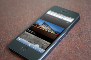
Step 1, of course, was the name. And there were literally dozens of options on the table. The partners gravitated toward WORKSBUREAU in the end because it had a unique sound rolling off the tongue and provided an interesting way to tell the firm's story. This initial phase included professional photography, securing and developing a SPLASH page to be utilized while the rest of the project was being developed. Here's how that was translated online:


Eventually, the front page of their web site would simply feature the dictionary definitions of the two merged words, leaving the reader to make the connection while viewing the work:

works noun \ˈwərks\

1. things produced or accomplished by effort, exertion, or exercise of skill

2. things produced by the exercise of creative talent or expenditure of creative effort : artistic production


bu·reau noun \ˈbyu̇r-(ˌ)ō, ˈbyər-\

1. writing desk; especially : one having drawers and a slant top

2. commercial agency that serves as an intermediary especially for exchanging information or coordinating activities


Next came the brand identity, which actually was developed relatively quickly and easily out of the naming process. The WORKSBUREAU team liked the look of the word in a sans serif font in all caps, combined with clean design that would later allow for a focus on their projects rather than the brand identity itself. And, the Kitchen Sink team developed a bright, cheerful and energetic color palette to accentuate the new brand.

"We wanted to do something that would give them a lot of flexibility, and be distinguished without taking away from where the real focus should be," said Doug Bell, Creative Director for Kitchen Sink Studios. "But we also wanted it to have a friendly feel, to reflect on what it's like to work with their team, so we went with some really bright spot colors to make the business system professional but fun."

With the new brand in place, the Kitchen Sink team then began work on developing the kind of web presence that would showcase the company's work in a truly interactive and compelling way. The site would be all about the work itself, with the story told through professional photography of both the WORKSBUREAU team and its exceptional projects.

The Kitchen Sink team developed a site that brings the company's work to life in front of the viewer's eyes and allows the viewer to explore the wide variety of projects WORKSBUREAU has completed around the world.


"Because of the complexity of the design, WORKSBUREAU.com is one of our most ambitious sites to date,"said Dan Freeman, Kitchen Sink Studios' Lead Web Developer. "We had to create a fully responsive site that was extremely image heavy. It also had to have a CMS backend that could easily be updated by the WORKSBUREAU team after launch. All of these elements together can bring load times to a crawl.

The site even allows the user to choose which of the accent colors they prefer for viewing the site — which is designed to be indicative of the level of detail and the quality of the experience of interacting with the company's works. And, it contains content-management features in several sections that allow the WORKSBUREAU team to make additions and changes to the site from any standard web browser.


"We developed a site architecture that would only feed the appropriate sized images for the user's screen size to keep the site fast even on slow mobile networks. This combination of CSS media queries and jQuery responsive images were all built on WordPress, which is something that is one-of-a-kind on the web today."


The Kitchen Sink Studios team is very proud of the work completed for WORKSBUREAU in helping to create their new brand and web presence, and enjoyed the process of working with this exceptional group of professionals. We look forward to seeing what kind of innovative, imaginative architecture they will continue to produce!